This past weekend I had the pleasure of attending the 10th annual Philly BarCamp. Though I’ve attended years past, I’ve never had the itch to give a talk. This year was different. Over the past couple of years I’ve come to cultivate a fondness for well constructed design systems for the web. Apparently that fondness culminated into me deciding to put my thoughts together in a handful of slides the night before BarCamp 😬
At this point you might be asking yourself:
(This was my amazing Kindergarten Cop reference that got at least one sympathetic chuckle).
Although design systems have been around for quite some time, I can’t help but feel they’ve only gotten serious attention on the web within the past few years, after being thrust into the spotlight by some big-deal companies. Salesforce has their Lightning Design System, IBM has Carbon, Intuit has their aptly named Harmony design system. Even Walmart has joined in the fun.
Ok, that still doesn’t tell you what a design system actually is. A quick googling will point you to a CSS Tricks article from Ara Abcarians:
“From typography, layouts and grids, colors, icons, components and coding conventions, to voice and tone, style-guide and documentation, a design system is bringing all of these together in a way that allows your entire team to learn, build, and grow.”
To me, this can be simplified a little. I say, for better or worse, a design system is a collection of various types of style guides. “Well, what’s a style guide then?” you might be asking. Style guides can come in many different forms, but they all share a similar goal: to standardize a particular type of “thing”. We’ll concern ourselves with 5 types of style guides here:
Brand identity style guides are nothing new. The 60's and 70's were an amazing time for graphic design and some key style manuals were created by pioneers such as Paul Rand and Richard Danne. These became the basis for how we think about style guides today.
This is may be what most folks who work on the web are used to. Colors, typography, buttons: the basic building blocks of a website. Here's Marvel's style guide as an example:
These style guides speak to the "voice" of a brand. How does a product or company speak to it's customer or user base. MailChimp offers a shining example of this:
As a developer, this is the type of styleguide I might have the most influence on here at P'unk Ave. In fact, we have our own coding styles and best practices that we use internally. This type of guide tells developers how the codebase for a project should be written/structured. Do you use tabs or spaces? Are semicolons really necessary? (Spaces.. and YES, if you're wondering). For illustrative purposes, i'll point to one of GitHub's:
I like to think of this type of "style guide" as a higher fidelity version of a design language guide. This is where patterns and styles get combined into larger "chunks" of a website. If done right, it might show you how code is structured for these different elements as well. If you're thinking in terms of Brad Frost's Atomic Design Principles, this is where the molecules and organisms might get fleshed out. Here we see a portion of Lonely Planet's design system Rizzo:
Ok, all these style guides/pattern libraries are great, but why do we need them? Why not just design something and build it? Why do we need so many artifacts?
When a user begins to navigate your website or app and they're presented with consistent patterns, the UI becomes familiar and could lead to greater conversions and an increase in your bottom line (if that's your thing).
Having a set of patterns to work off of can lead to an increase of productivity for designers and developers alike which could lead to more features and more iterations in a shorter amount of time.
Having established patterns in a central location creates a more unified vocabulary across teams, which means more time working collaboratively and less time in meetings!
Consistent patterns make for more performant experiences that can be optimized for accessibility more readily and easily.
Style guides and pattern libraries become a valuable resource for standards and best practices over time.
Having a design system allows you to quickly and easily modify, extend, and improve your product or site over time.
That all sounds great, right? So, who is a design system for anyway? Design systems for a product is an easy sell, but how does this apply to smaller sites and client services? There's a great article by Dave Rupert where he points out:
“Responsive deliverables should look a lot like fully-functioning Twitter Bootstrap-style systems custom tailored for your clients’ needs. These living code samples are self-documenting style guides that extend to accommodate a client’s needs as well as the needs of the ever-evolving multi-device web.”
No matter the size of a site, creating a style guide and a set of patterns should be standard practice. Any sized project can reap the benefits of a design system.
Convinced yet? You might be wondering at this point how you might get this all started, or how you might begin to rethink an existing project. More importantly, you might be wondering how you might get buy-in from your client or team to do such a thing. Here are some basic steps you might take:
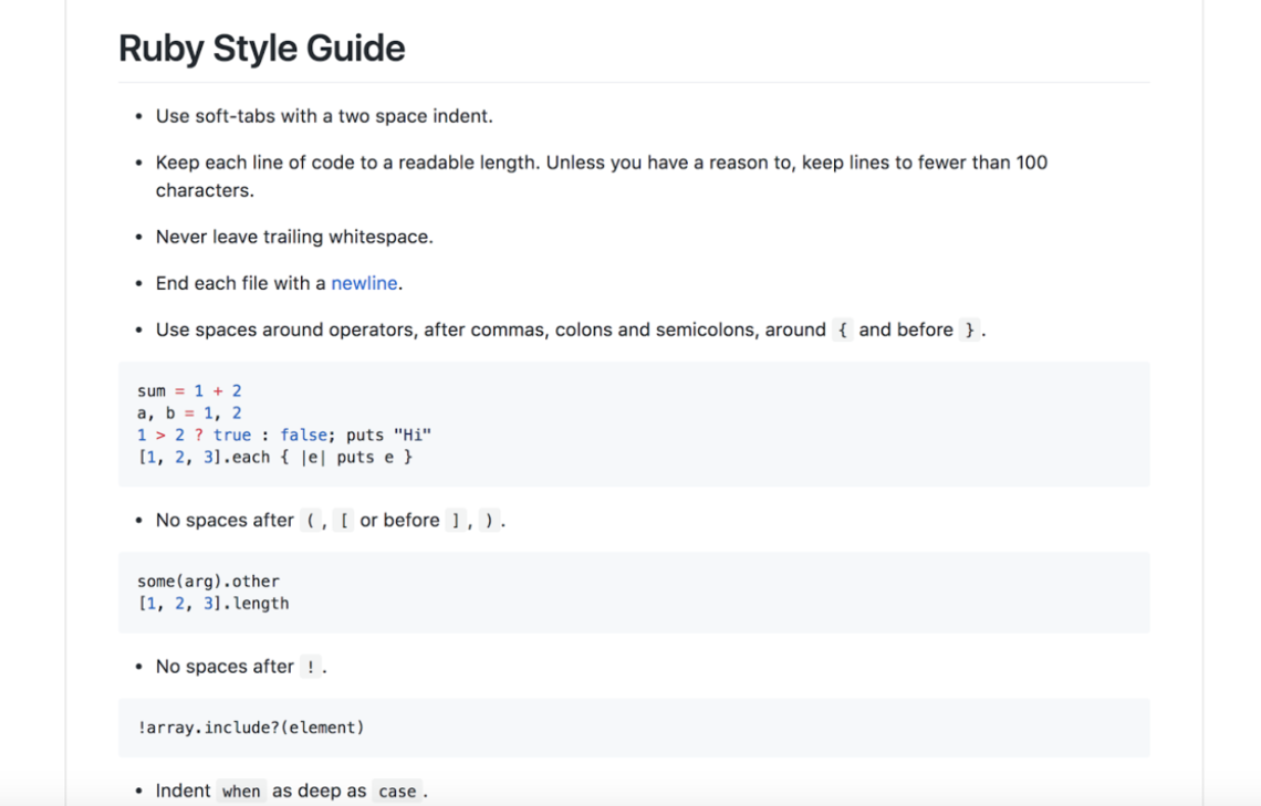
This consists of documenting current design patterns. You might gather all of the different button styles across your site, for instance. From here, you'll want to point out inconsistencies in these patterns. This can be tedious, but can point out some serious flaws in your current understanding of the cohesiveness of your site. Having gathered all of your existing elements and highlighting the inconsistencies, it should be fairly easy to make the case for why you might need a design system. From here you can develop a scope of work and create a shared understanding of what the system might consist of, laying the groundwork for creating a pattern library.
Next, you're going to want to come up with a plan of attack for how you might flesh out a pattern library for your new system. There are a growing number of tools out there to help you do this. Some methods you might use:
Think of these as basic mood boards for the look and feel of your new direction. There's a whole site devoted to this here: http://styletil.es/
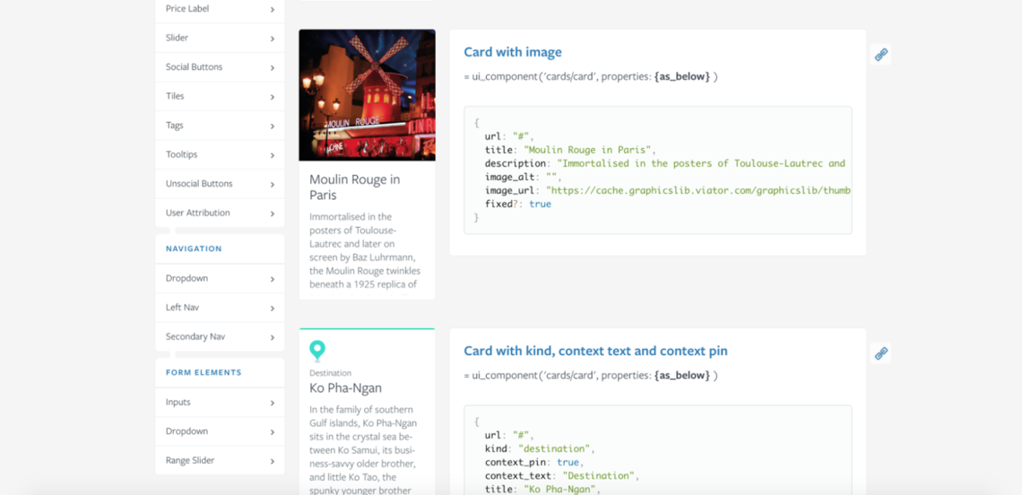
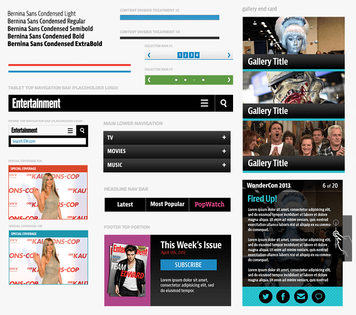
Using this method you would gather different iterations of key elements for further consideration and refactoring. Here's an example from Dan Mall:
This we've already gone over in some detail. You can dive right in or you can use something like Pattern Lab.
Traditional web style guides are a great place to start, especially with smaller sites and client work. Here's an example portion from a recent project here at P'unk:
The final method I'll mention here is to jump right into coding. As a developer, I find it's important to establish patterns in code early in a project. Fleshing out elements and patterns in code can pave the way for an easier build later on. A "living style guide" can be established fairly early in the process and might look something like this:
After you've established a direction, it's important to keep your momentum and build out your system:
There are a lot of folks that make a design system a success. Designers, developers, content strategists, and UX strategists must work in harmony for a system to work.
Your work isn't finish when you've created your system. In order for a system to be maintainable, there are some key characteristics it should have:
Developers and designers have to know how to use the system once it's in place. This is especially important when new designers and developers might be onboarded halfway through a project or even after a project has launched. For a great example of this, you can actually look at the U.S. Government Web Design Standards, where they beautifully outline guidelines for folks to follow based on their role:
In order for a design system to be approachable, it has to also be in a place where everyone that uses it can access it. A lot of large design systems have even gone so far as to open source their system, or simply make it available to the general public. This lead to the creation of styleguides.io: a collection of style guides and pattern libraries that are out in the wild.
For sustainability and extensibility purposes, it's important for a system to not be too opinionated. For example: a block that might be used to display courses on a university's website, might also be used to display events or news articles, so instead of calling this block a "Course Block", you might call it a "Featured Block". This has a trickle-down effect and the same thinking should go into things like coming up with CSS classes when it comes time to build out the site.
In order for a design system to be successful, you have to show how the different parts work together. Bootstrap actually does a good job of this on their examples page:
It's important that a design system doesn't become an artifact of the design process. It should be a living thing that evolves with the project over time. It should reflect the changes that a site goes through over time and should always be a jumping off point for new features and updating already existing features and components.
If you want to learn more about design systems, I encourage you to join a growing number of designers and developers on the design systems slack team. There's also an entire conference devoted to design systems called Clarity where you can hear the latest from industry leaders and experts.